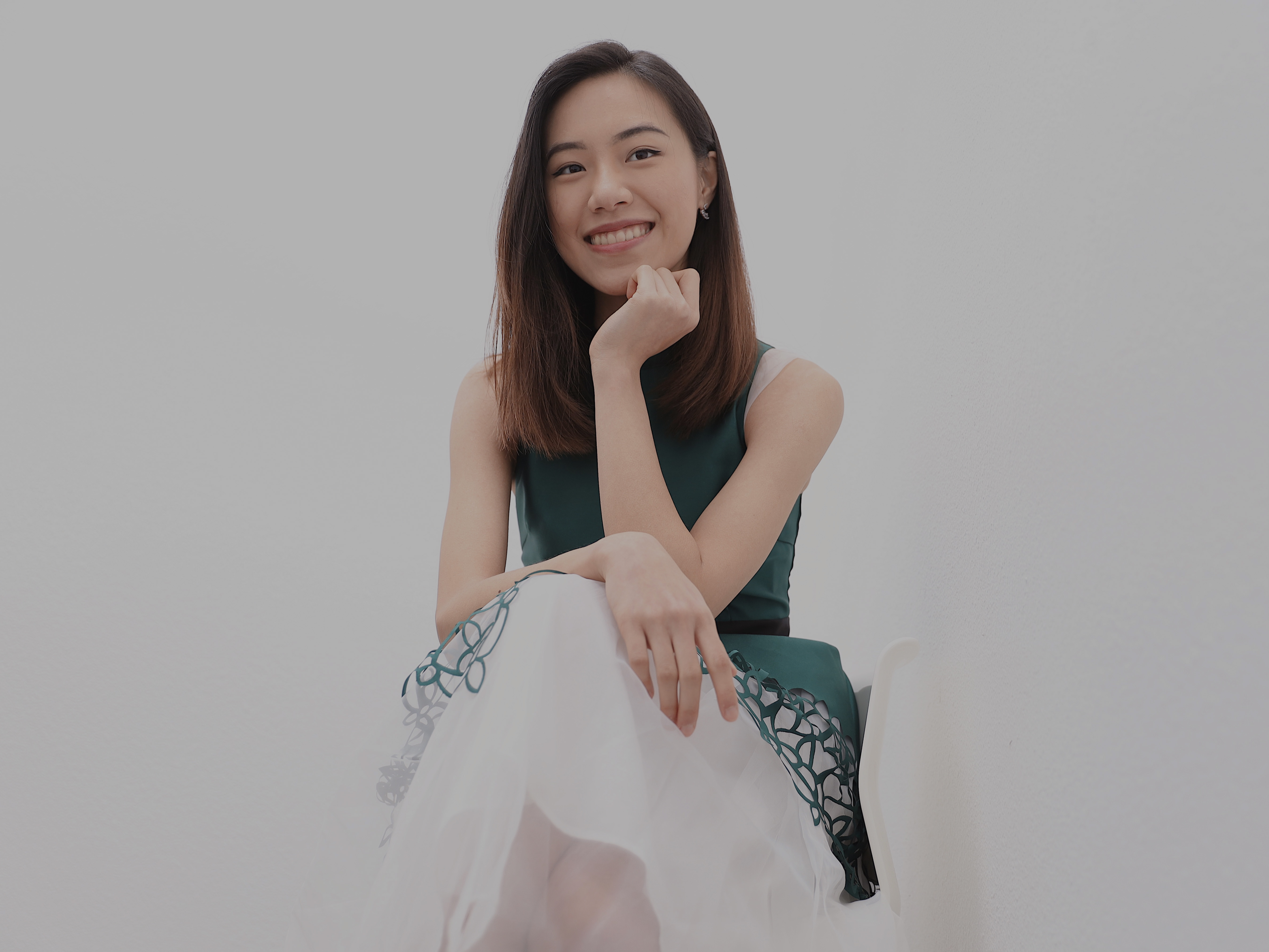
Growing up creative art is another big part of my life besides music. I was thrilled to have this opportunity to grow my skills in design, as well as creating digital illustration. Both in music and art, I found its inspiration and beauty. I enjoy all forms of creativity, and I believe that the interaction between making music and art are integral and filled with resonance.
This is a place where I am presenting some of the work I did for a graphic design class I took this year (also known as my last year of undergraduate)!

Favorite Place Flyer
This is my favorite place flyer project. I created a flyer of the beautiful Amalfi Coast in Italy, where I traveled there in summer 2019. In this project, I found the “Layers” function very useful because it allowed me to stay organized while adding more elements to the flyer. My favorite part of the process was to showcase some of the pictures I took and combined them with some of my good memories.

Photo Collage
This is my Photo Collage project. My favorite part of this project was to learn how to add layers effect and discover how they look so differently when blending in with other pictures! I was truly inspired by the music lyrics presented here, and I hoped to visually convey the meaning of words through my photos.

Plus Image
This is my Plus image which I thought was the easiest among all the work we did for this class. This project was quite fun because I got to use one of my favorite B&W photography and fit it into a video camera frame that I was holding. My favorite part of this image is the simplicity of my color scheme that brings out the photography.

Minus Image
This is my Minus image. It was so fun to use one of my favorite pictures and choose what subjects to remove from it. With much patience and carefulness, I was able to remove two people that were sitting on the grass in the original photo!

Multiply Image
This is my Multiply image. It was really cool to learn how to use the clone tools to multiply selected parts of an image. The plain background here not only brings out the uniqueness of the roses but also makes the multiply process a lot easier! A trio of roses with fairy lights, perhaps a glass of wine would be fitting!

Pen Tool Portrait
This is my Pen Tool Portrait Project by far the biggest project of this class! One significant lesson I learned through this project was to set goals for day-by-day progress. Despite the challenge of this project, I was still able to have fun with tracing the original image. My favorite part of the process was to elaborate my works by adding elements such as shadows and highlights.

Upclose Pen Tool Portrait
A specific part that I am most proud of was definitely the flower on the ice cream as well as its shadow. It was the most challenging part of this illustration as my goal was to bring out the details of each layer of pedals and makes it look realistic.

Band/Artist Promotion
This is my artist brochure project, which I chose to make a promotion campaign for one of Laura Story. It was very fun to work on this project as she is one of my favorite Christian artists. This project taught me that simple shapes and graphic elements can be so effective in creating a brochure. Especially, I learned that using similar designs or colors makes the brochure very cohesive as a whole!

Animated GIF – 1
This is the first gif I created as a part of the promotion campaign. I was surprised how simple the process can be in making a gif. Here I decided to use simple designs to underline the color schemes in each layer. It was a little hard to get started, but it definitely got easier as I experimented with each gif.

Animated GIF – 2
This is my second gif for the campaign. By adding my favorite lyric line of the song “Blessings”, I hoped to share the beauty of her words. I had fun experimenting with animation and colors on this, and I am very glad how it turned out!

Animated GIF – 3
This is definitely my favorite gif in this campaign! I created a portrait illustration and some decoration by using pen tool. Through the process, I learned how to effectively use the space to create an animation. The part I loved the most was using some welcoming words and animated illustration as if I am introducing the artist out.

Illustrated Map
This is my Illustrated Map project. I really enjoyed designing this map for my hometown, Taipei. I love specifically that I was able to illustrate some of my favorite spots and bring out some aspects of my hometown that are meaningful to me. Through the process, I learned how to sketch each decal of the places and how it is important to prepare for digital illustrations.
